
Filmfest
A UX & product design exploration for a mobile app that solves the age old question, “what should I watch tonight?”
This is a passion project of mine almost four years in the making. Initially conceptualized while still in school, this was born of a semester long project and turned into something I would revisit every 6-12 months. Building something for myself is easy, I am the audience!
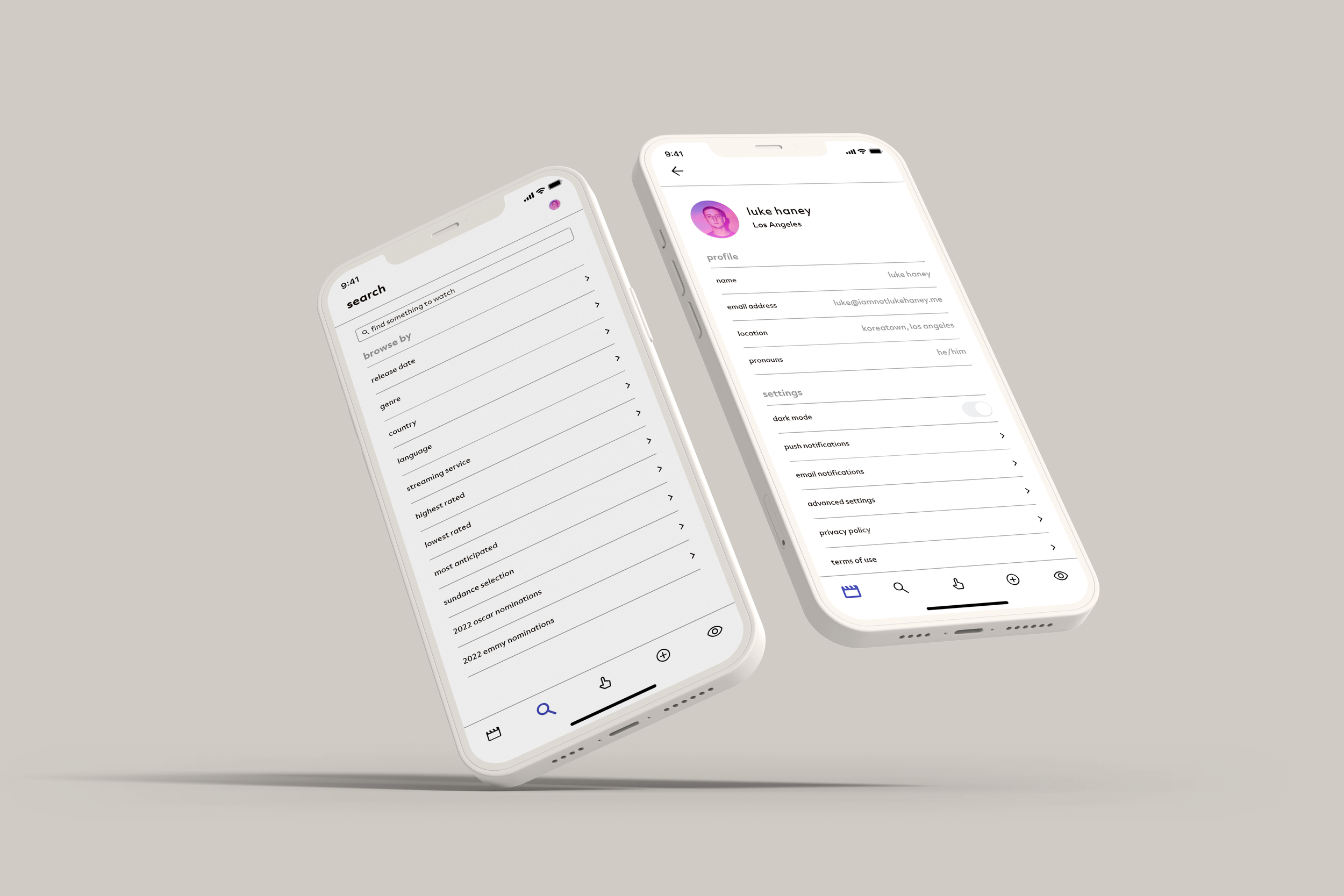
The name, Filmfest, is a subtle homage to film festivals (I bet you didn’t catch that one), but more specifically their collections. I knew the North Star of this product is to deliver an informed and carefully curated selection of movies to each users taste, and I wanted this application to reflect that both in form and function.

Off the bat, I had a few things I knew about the design I needed to include. When I think of “curation'“, I think of museums — white walls that give the art room to speak, and this needs to do the same. The movies, and more specifically when speaking visually — the posters, need to be the focus.
Upon start up, the user is brought to the “for your consideration” tab, which is our “home” or “landing page”. This is where the core of the application lives, this is where the user finds their curated collection of movies. Instead of having a wall of posters to endlessly scroll through, these movies are divided up into sections that would reflect the users taste so they can have some agency and choice in selecting from this list.
Another major pain point I wanted to tackle with this application was helping users find where they are able to watch the movie they have selected. Clicking on a title will of course bring up details about the movie, but I needed to have the platform(s) that it was available to watch on easy to find and see, no scrolling!

But how does the user get a selection of movies that reflect their preference in movies? With the backbone of our app, (and a repurposing of Tinder’s famous functionality) — “curate your taste”.
Instead of recommending based on how a user would scale movies out of one to five stars, this tab breaks down the users relationship with movies to four possibilities
The user has seen the movie and liked it
The user has seen the movie but did not like it
The user has not seen the movie but wants to (adds the movie to their watchlist)
The user has not seen the movie and isn’t interested in doing so
Through some magic in this hypothetical that a developer who is a million times smarter than me would develop an algorithm based on this, the swipe feature would inform what movies a user is shown.

Although I minorly condemned a traditional star rating system earlier, what would movies be without critics? Apps like Rotten Tomatoes, IMDB and Letterboxed show that people love to review movies, and we don’t want users leaving our space to do so. Our fourth tab on the nav bar “log & review” allows users to post about what they watch, adding a social element to Filmfest.
Because this is a project I revisit so frequently, I am already thinking of what I will rework or amend on my next pass at this. I think the “log & review” section has the potential to be expanded the most, with the integration of tagging other users, a dedicated feed for seeing other reviews and many more features I wont talk about because I haven’t gotten around to any of it yet.


While largely unintelligible (even for me and its my own handwriting), I love looking back on the process for this application, to see how it has evolved over the years. What began as “tinder for movies”, has become so much more to me!


