
AOL MyBenefits homepage redesign
One of the fun (and unique) parts of my hybrid position at Yahoo was the department utilizing my youth and inexperience as a tool for bringing a fresh look to the AOL brand. For the entirety of my time at the company, there was no team or individual overseeing the brand guidelines/styles for AOL, so I was allotted a generous amount of freedom in bringing the brand into the future when redesigning some of the assets.
AOL has a uniquely older core audience (55+), so we always kept the demographic in careful consideration when restructuring or changing core elements of the design. These redesigns for the AOL Support Plus dashboard and subscriptions checkout redesign are functional, simple and digestible. These are meant to be easy to understand and navigate so our older audience can easily manage and pay for their subscriptions.
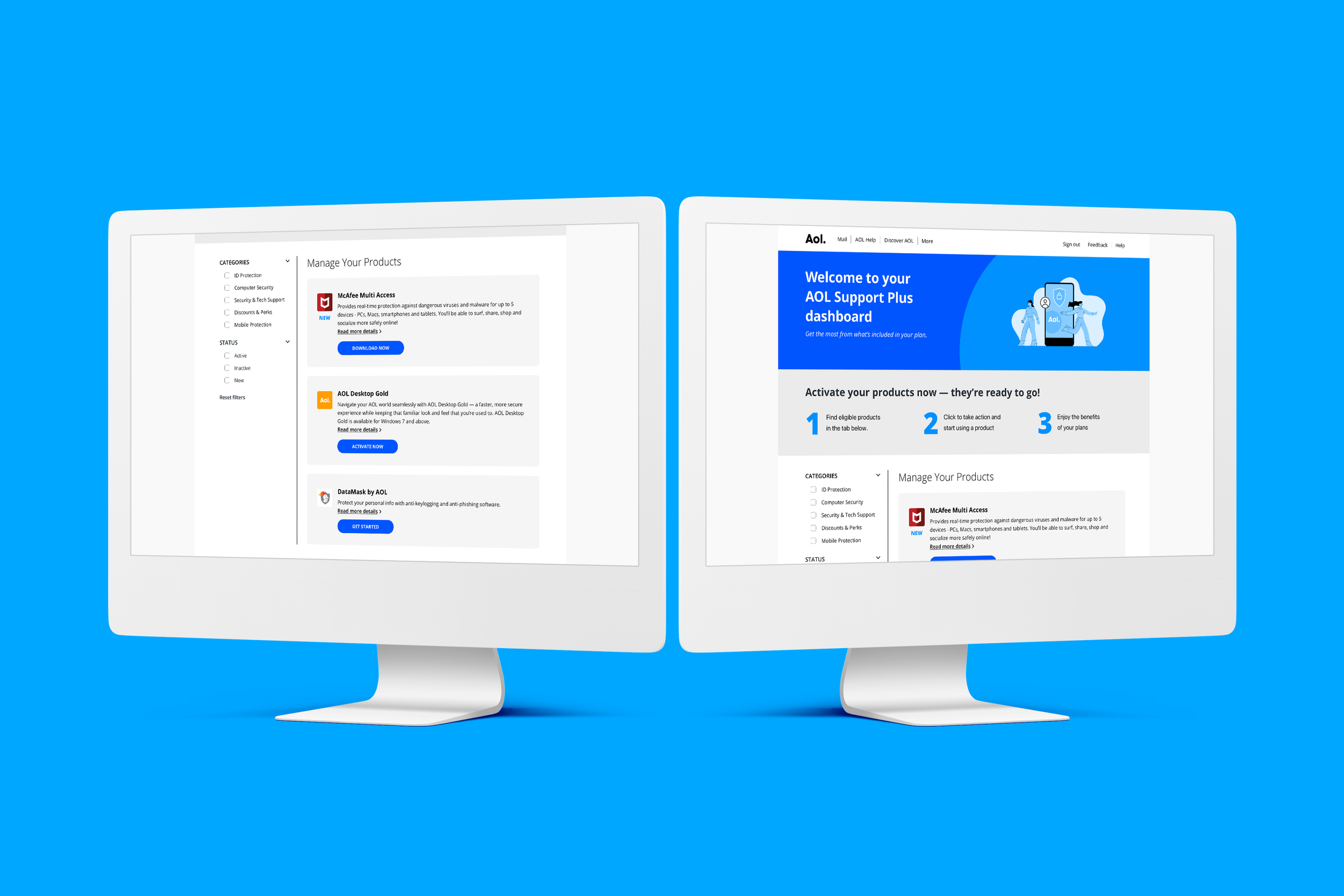
The iconic AOL blue has been one of the few core brand elements that has stood the test of time, and is always a favorite of mine to include. Iconic, familiar and punctual.


Old Design

AOL subscriptions checkout redesign
A lot of the AOL and Yahoo subscriptions are 3rd party services that we resell under our familiar and iconic brand. As a result of this, there is a lot of legal copy to include on our pages, the purpose of this redesign was to simply the checkout experience, and include a way for the copy unique to each plan be included without making the page a finger workout to scroll through.

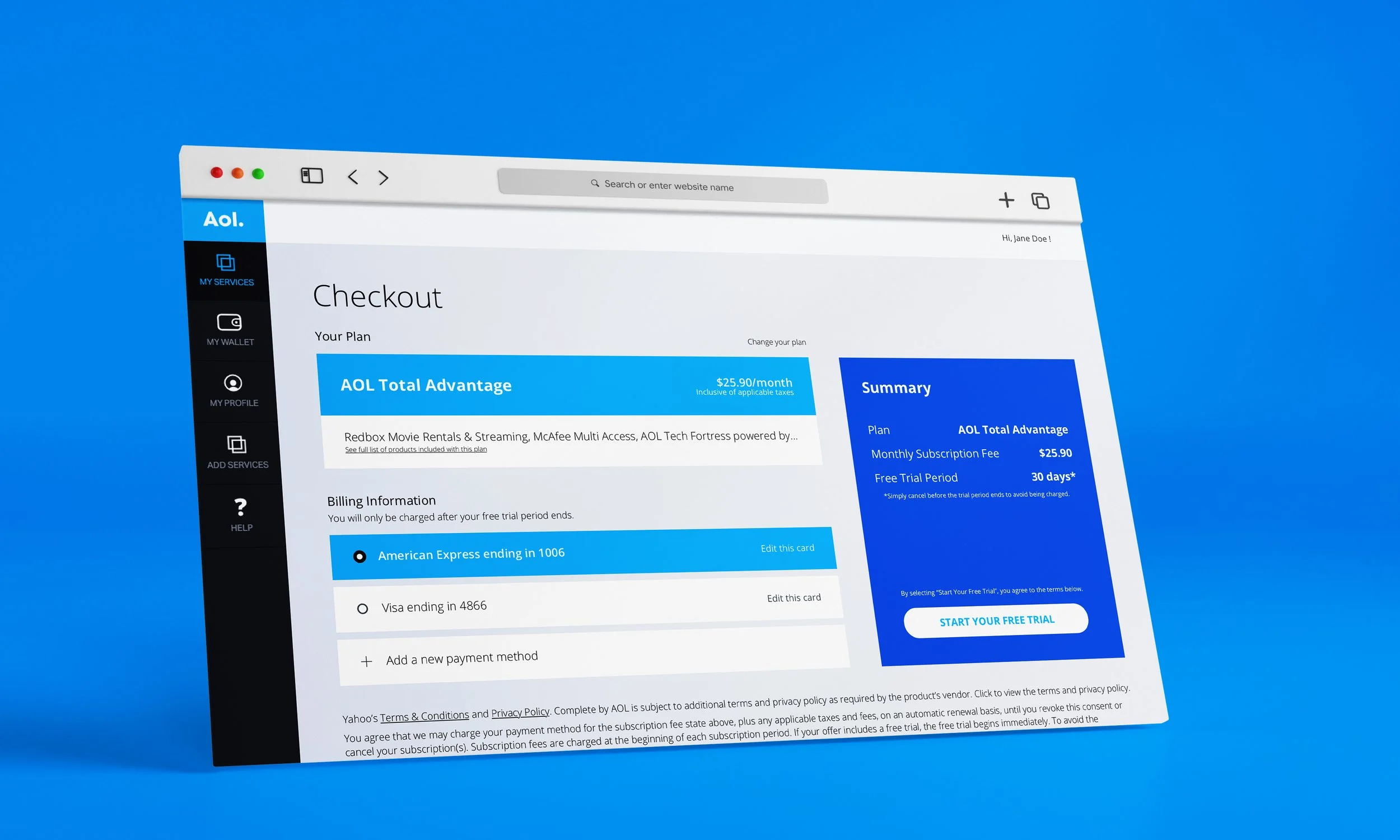
Modals really are a savior to the scroll wheel, creating a 3D element to an otherwise 2-Dimensional page. With a bundle that has so many individual plans included, we allow the user to see the specifics with a quick click, instead of a tedious scroll.


